Designing the foundations of a new insurance platform.
Helping transform complex specialty-insurance workflows into a clearer, more efficient and user-centred product experience.
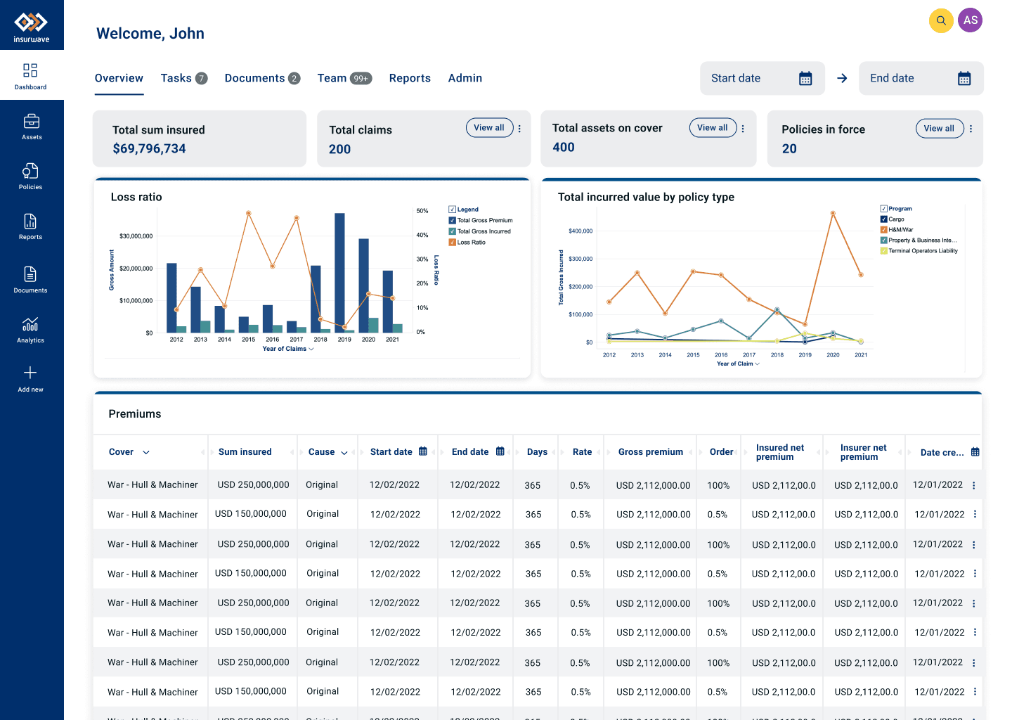
Making complex insurance workflows easier to understand, manage and act on.
Insurwave is a B2B Insurtech platform designed to connect insurance buyers, brokers and insurers while making complex insurance data easier to manage and understand.
As the founding UI/UX designer, I worked across research, UX strategy, interaction design, visual design and front-end delivery to help evolve the product experience.
The opportunity
Improve existing journeys, introduce more self-service capabilities and create a clearer way for users to understand and manage their assets.
How do you simplify a complex B2B insurance product without hiding the complexity users need?
Specialty insurance involves multiple stakeholders, complex processes and large volumes of information.
The challenge was not simply to make the interface look simpler. It was to help users understand the relationships between assets, policies, risks and actions while reducing unnecessary friction.
Complex workflows
Multiple tasks and stakeholders across the insurance lifecycle.
Fragmented information
Important information could be difficult to locate and connect.
Backend dependency
Some processes relied heavily on backend teams.
Limited self-service
Opportunity to give users greater control over their workflows.
Establishing the UX practice while designing the product.
As the founding UI/UX designer, I wasn't simply given individual features to design. I helped establish the design process while working autonomously with product, client-success and engineering teams.
Research
Business research, user research, field research, desk research and stakeholder workshops.
Strategy
Personas, hypotheses, user journeys and information architecture.
Design
Flows, wireframes, prototypes, UI and interaction design.
Validation
Stakeholder review, user testing and iteration.
Delivery
Design specifications, engineering collaboration and front-end implementation.
Starting with the business before designing the interface.
I began by working with senior stakeholders and cross-functional teams to understand the product vision, existing experience and opportunities for improvement.
Strengths
What was already working within the product and business?
Weaknesses
Where were users experiencing friction?
Opportunities
Where could product and UX design create value?
Vision
What did stakeholders want the platform to become?
Understanding the people behind the workflows.
Research explored the different roles involved in specialty insurance and the tasks, goals, behaviours and pain points associated with each.
Insurance Buyer
Understanding risk, assets and insurance requirements while coordinating with other stakeholders.
Broker
Managing relationships, policies, quotes and communication between parties.
Insurer
Assessing risk, managing policies and making informed decisions around assets.
Research approach
Desk research
Insurance industry, terminology and existing product knowledge.
Field research
Interviews and observation within users' working environments.
Discovery sessions
Blank canvasing and collaborative exploration.
Synthesis
Tasks, goals, behaviours, tools, stakeholders and pain points.
From policy-centric to asset-centric.
Fragmented workflows
Users often needed to navigate between different areas of the product to complete related tasks.
Users think about the asset
Multiple tasks and decisions could be connected through the asset at the centre of the workflow.
Asset-centric experience
Bring relevant information, actions and context together around the asset.
Turning research into design hypotheses.
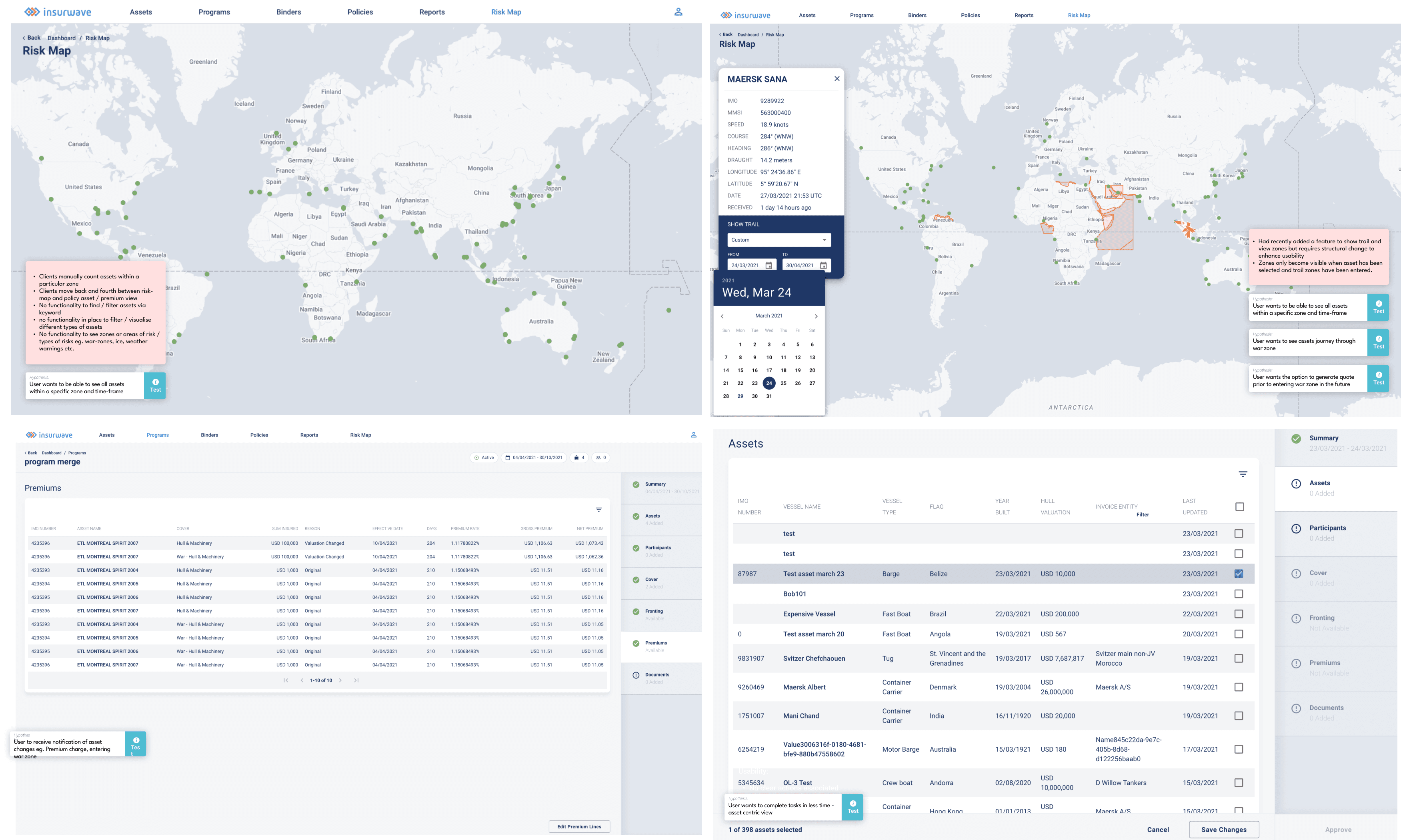
The research was translated into a series of hypotheses that connected user needs with potential product opportunities.
Risk awareness
Users want to know when an asset enters a war zone.
Risk visibility
Users want to see an asset's journey through a war zone.
Risk exploration
Users need to see assets within a specific zone and timeframe.
Proactive action
Users want the ability to generate quotes before entering a war zone.
Efficiency
Users need to complete multiple tasks in less time.
Turning insights into user journeys.
Primary journey
The strongest product story centred around helping users track an asset, identify risk, understand its impact and take action.
Supporting journeys
Track Asset
Filter content within the risk map
Create an agreed-rates quote
Collaborative workspace
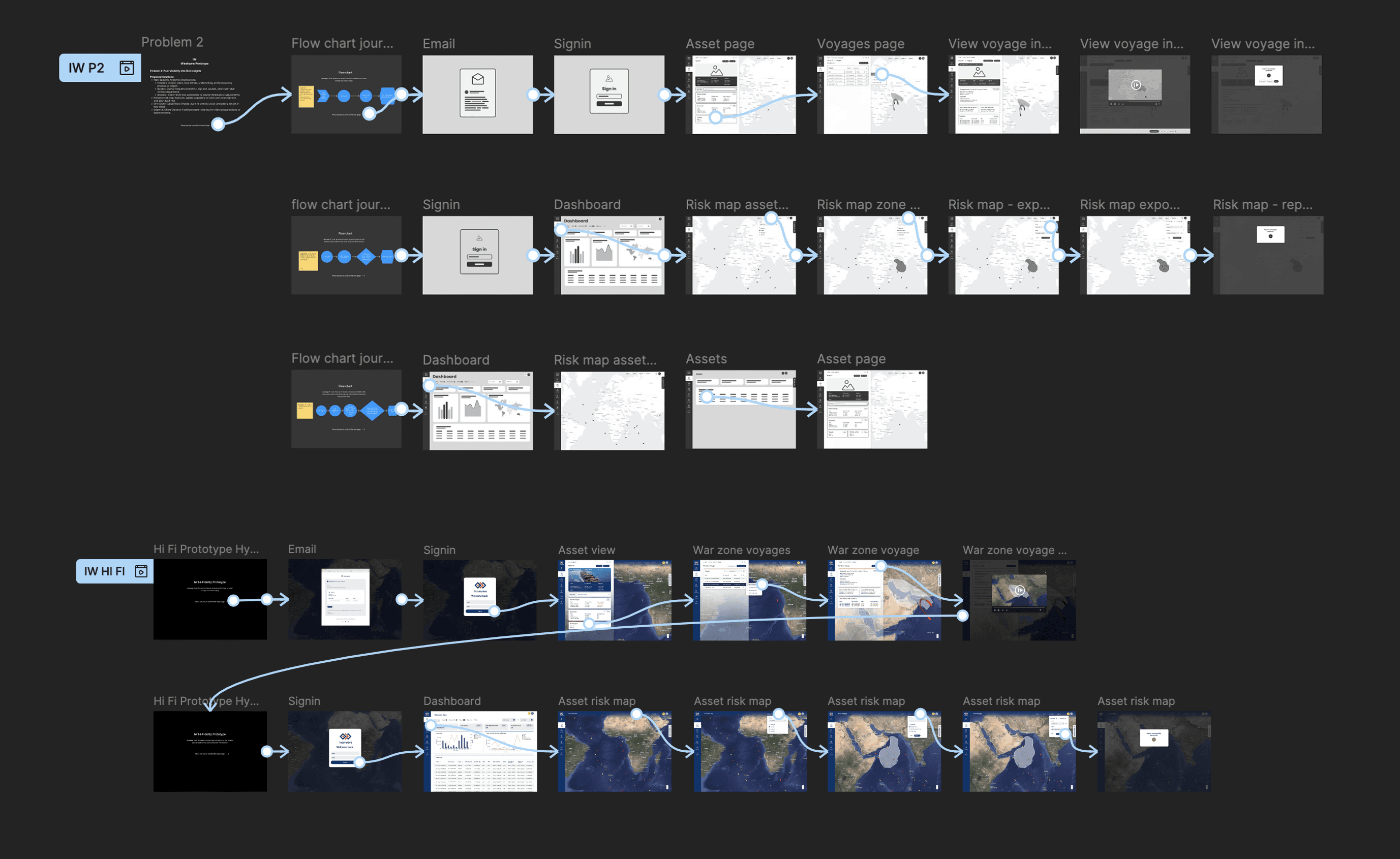
Prototype → test → refine.
Rather than moving directly into high-fidelity UI, concepts were reviewed with stakeholders and key user groups before being refined.
Concept
Explore possible approaches to the problem.
Low fidelity
Establish structure and interaction.
Stakeholder review
Test the direction against business requirements.
User testing
Present concepts to relevant user groups.
Iteration
Refine the experience based on feedback.
Restructuring the product around how users work.
Research revealed the need for clearer relationships between assets, policies, risk information and actions. This informed a reassessment of the information architecture, navigation and filtering.
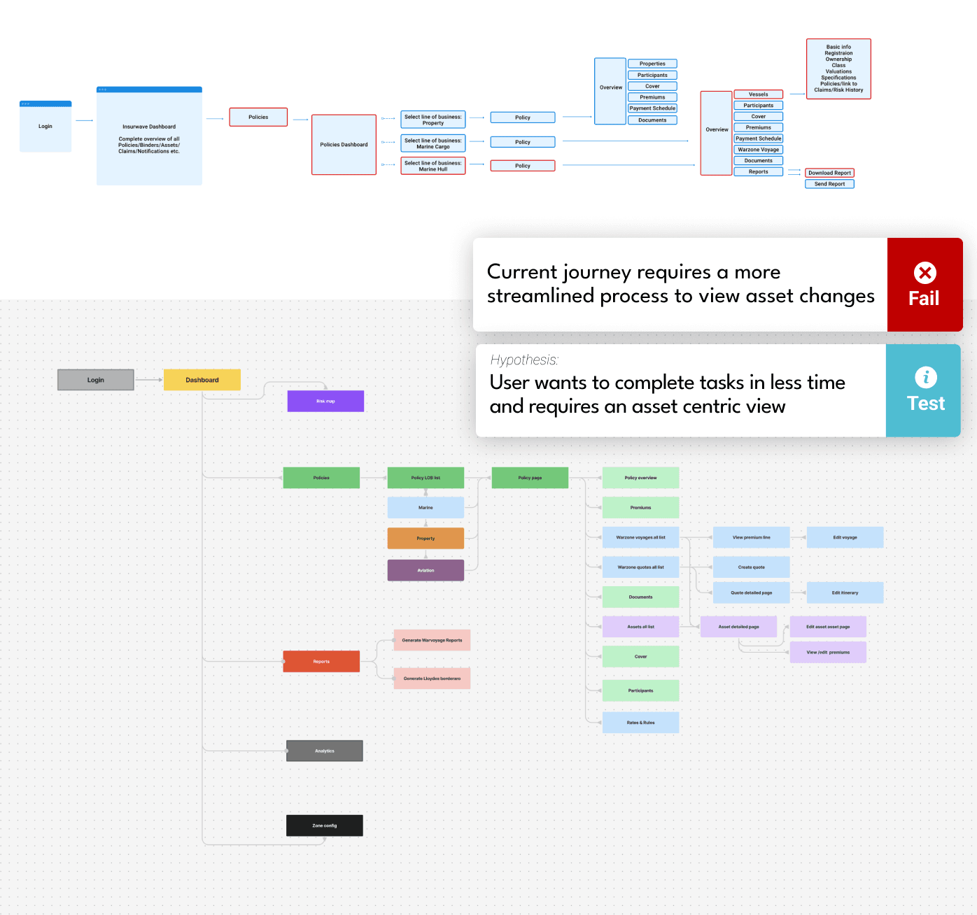
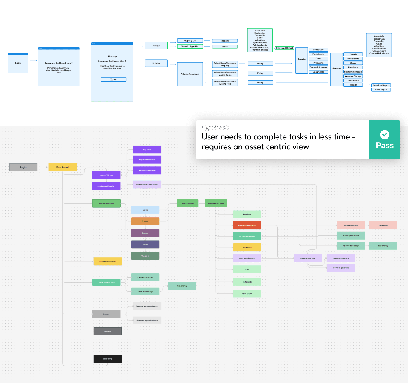
Make the asset the centre of the experience.
An asset-centric structure created a clearer relationship between information and actions, helping users complete related workflows with less navigation.
From structure to interface.
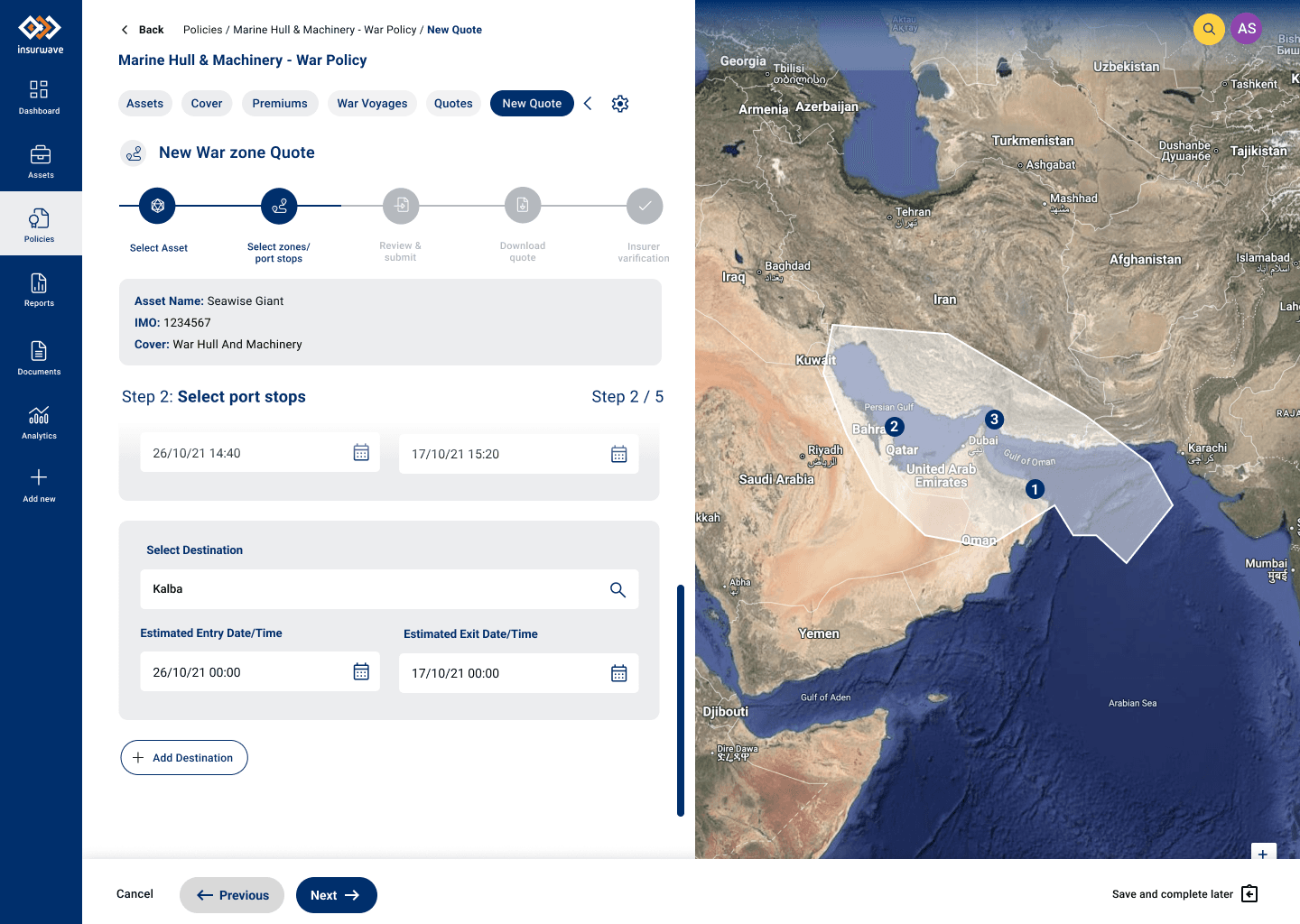
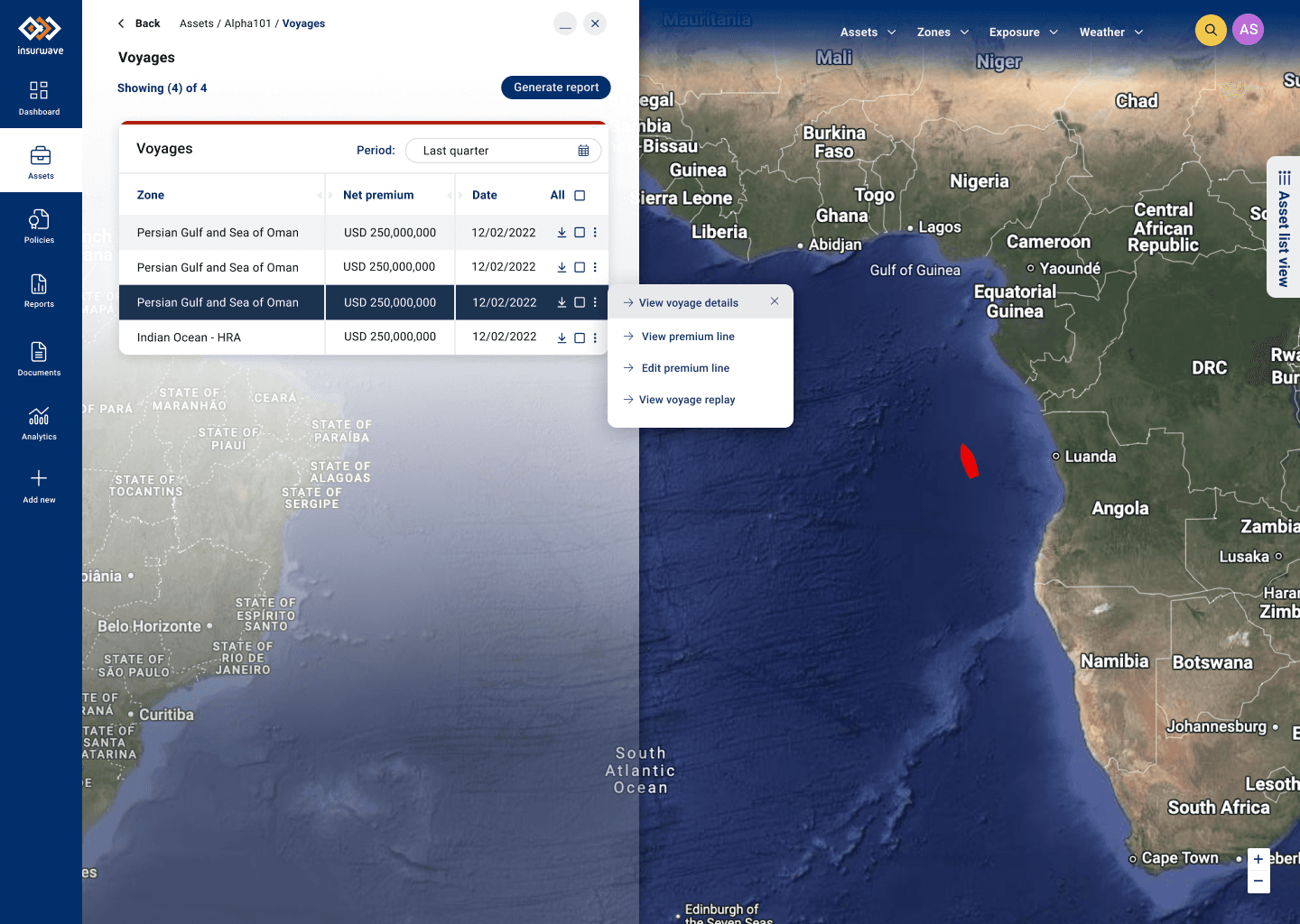
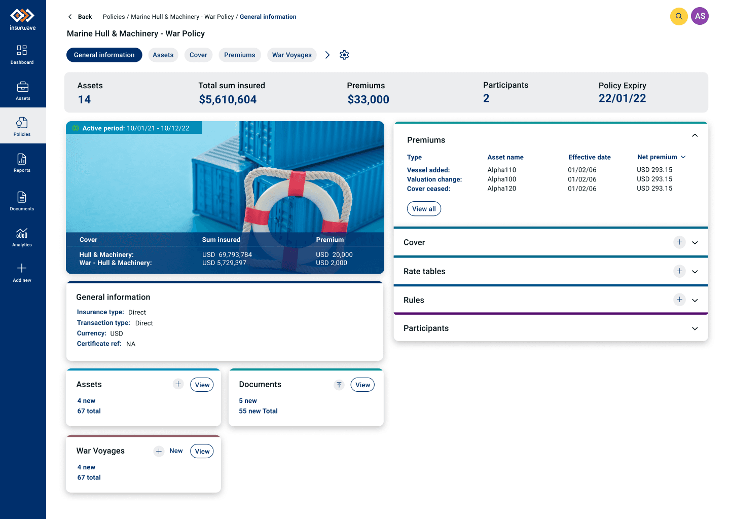
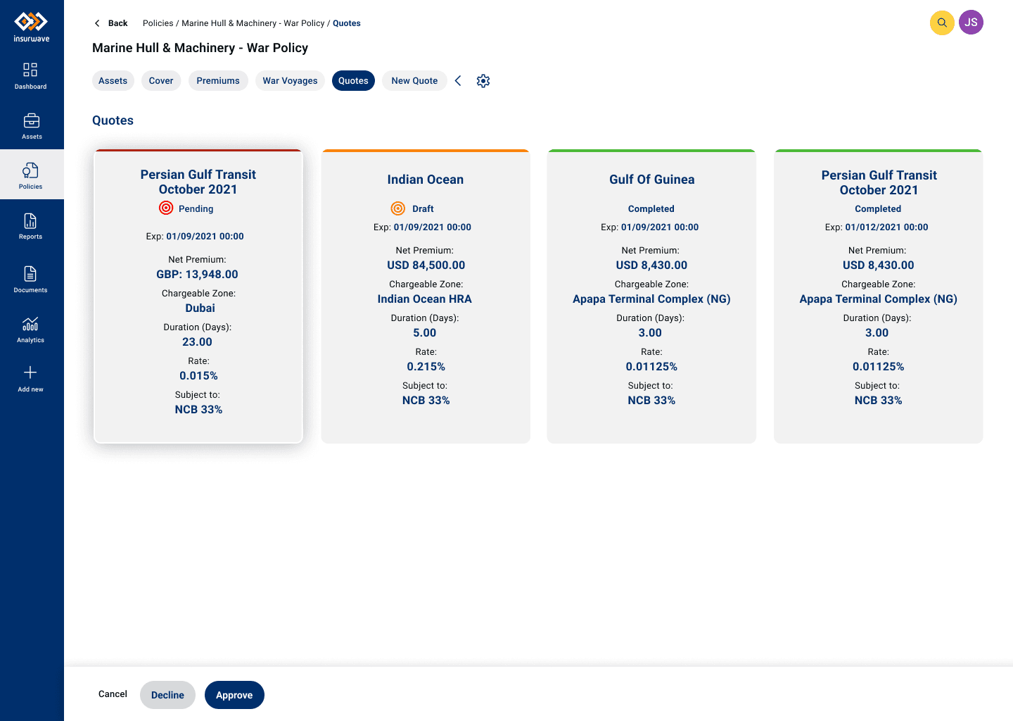
Once the underlying experience was established, I translated the journeys and information architecture into a scalable interface system.
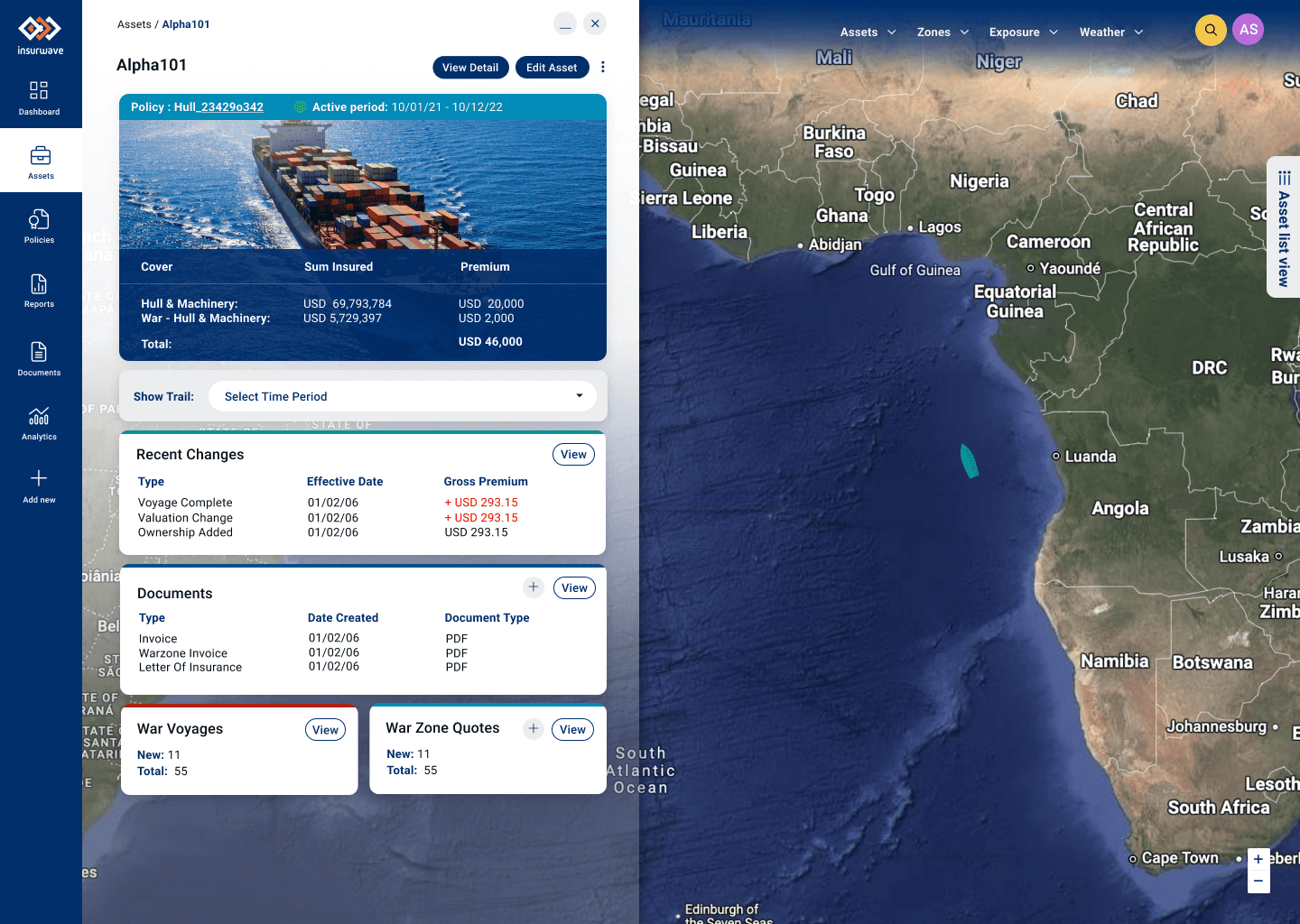
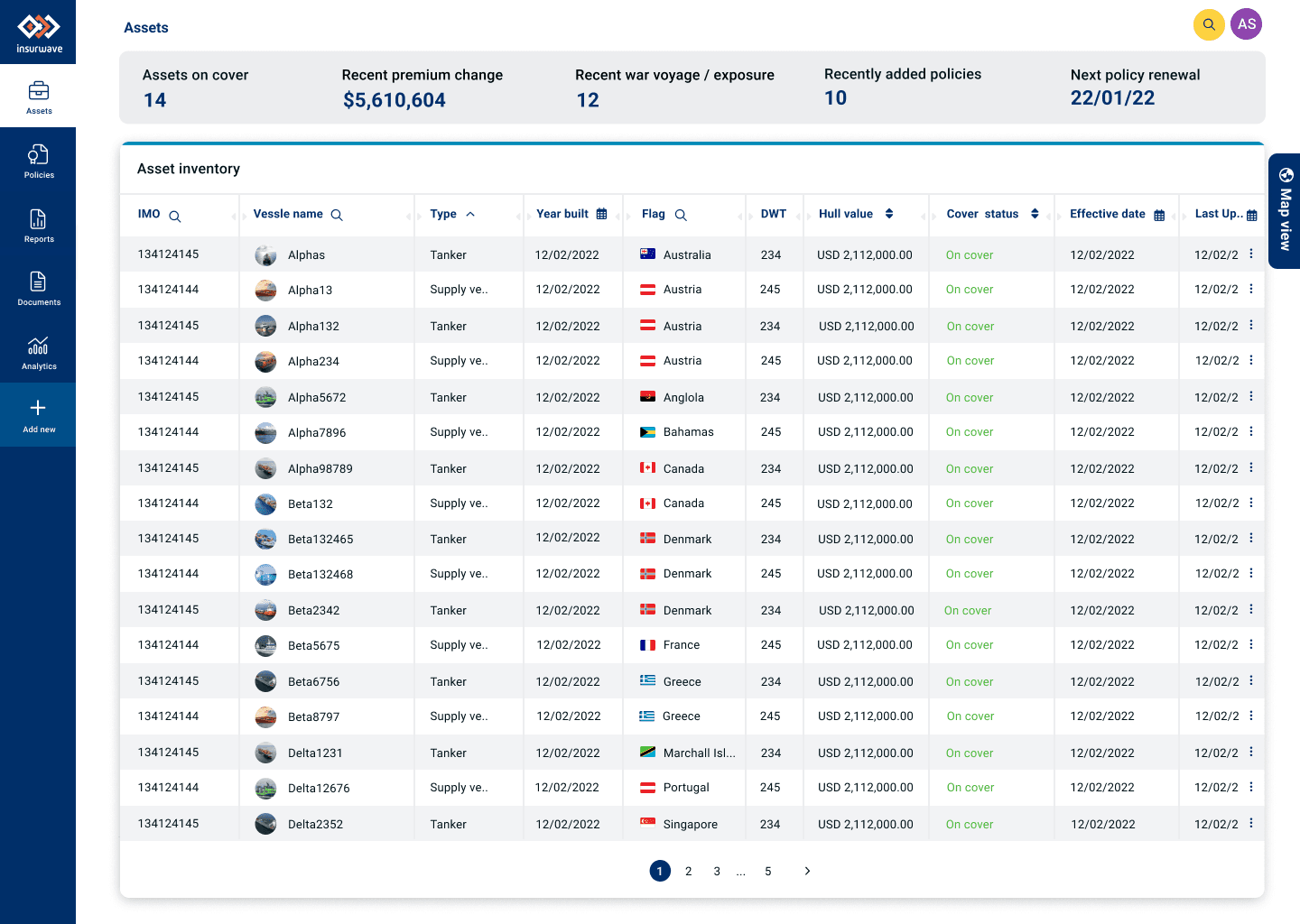
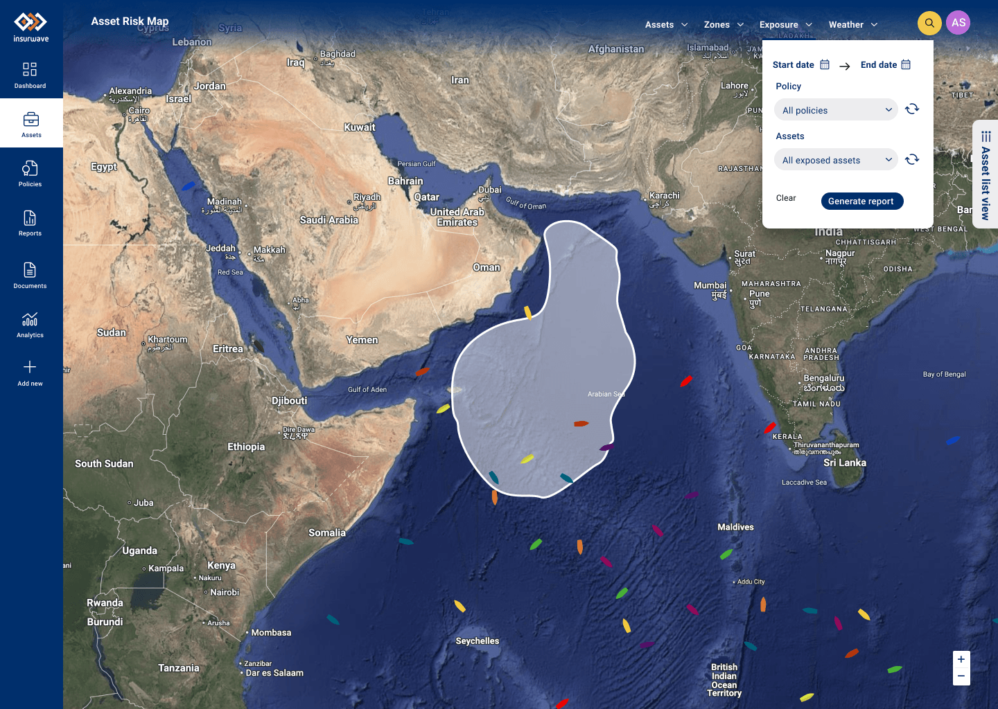

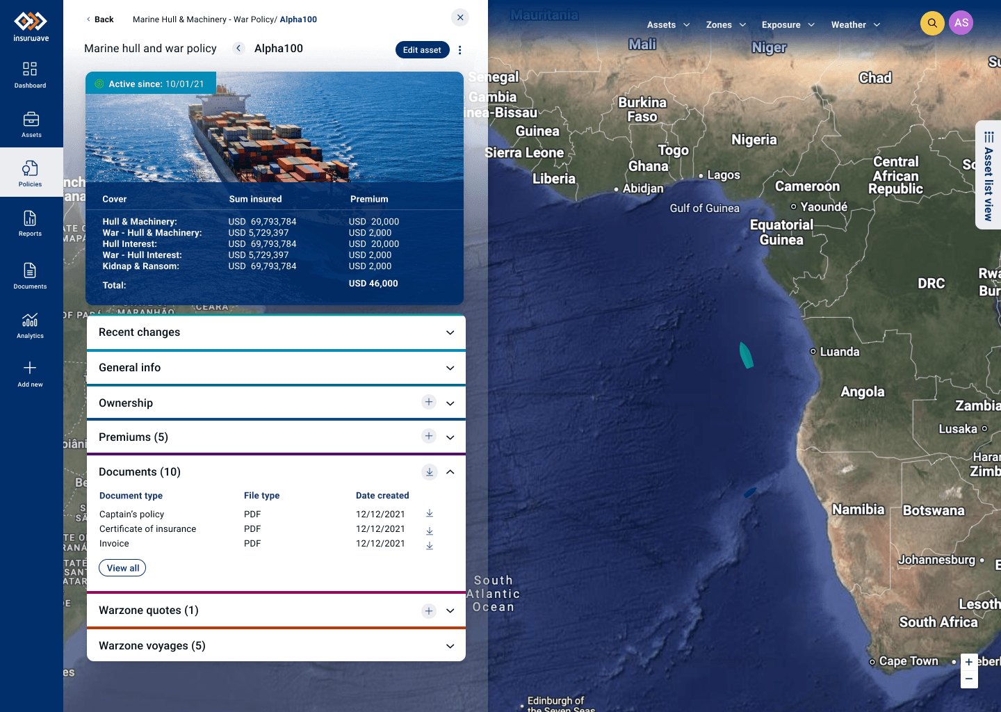
Designing for clarity and accessibility.
Typography
Clear hierarchy and readable type.
Contrast
Appropriate colour contrast across interface elements.
Content visibility
Important information remains easy to locate and interpret.
Responsive behaviour
Interfaces designed to adapt across screen sizes.
Interaction
Clear states and predictable interaction patterns.
Designing with implementation in mind.
Design wasn't the end of my involvement. I worked closely with front-end engineers to help translate the experience into the product.
Figma
User journeys, wireframes, UI and prototypes.
Specification
Content, fonts, icons, styles and interaction specifications.
Front-end
Translating interface patterns into working UI.
Engineering
Collaborating with developers throughout delivery.
Production
Reviewing the implemented experience and iterating.
Learning from how people use the product.
Product analytics and qualitative feedback were used to understand behaviour and identify opportunities for continued improvement.
Session behaviour
Understanding how users moved through the product.
Task completion
Looking at task length and user friction.
Feature usage
Understanding which capabilities users engaged with.
User feedback
Combining behavioural data with user observations and feedback.
Building a more user-centred foundation for Insurwave.
More user-centred product direction
Research created a stronger understanding of the three core user groups and their workflows.
More efficient workflows
The asset-centric approach created a clearer route through related tasks.
Greater self-service
The product moved towards reducing dependency on backend processes.
Scalable UX foundation
Journeys, IA, prototypes and design patterns provided a foundation for continued product development.
Stronger design–engineering collaboration
Design was carried through into implementation through close collaboration with engineering.
What I learned as a founding designer.
Working as the founding UI/UX designer meant there was no established design process to simply follow. I had to help create the process while simultaneously delivering product work.
That meant moving between stakeholder discovery, user research, product strategy, information architecture, interaction design, prototyping, testing and implementation.
The experience reinforced something that has remained central to my approach to product design:
Good UX isn't about removing complexity. It's about making complexity understandable and actionable for the people who need to work with it.